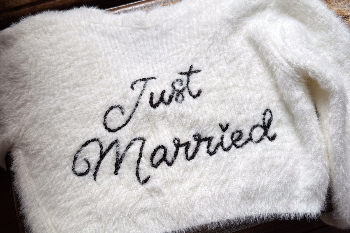
Monochrome Wedding Styling: Why Black, White and a Hint of Pastel Works Beautifully
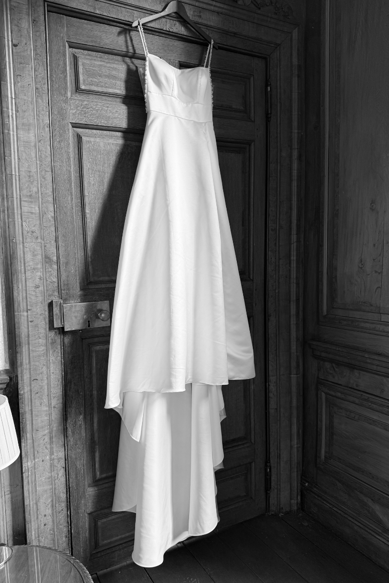
Black and white weddings have been a popular choice for years, and it's easy to see why. Elegant, timeless and effortlessly stylish, a monochrome colour palette creates a look that feels both modern and classic.
But one concern we often hear is that a black and white wedding can feel a little stark or lacking in personality. But this styled shoot proves exactly the opposite.
By layering monochrome styling with soft textures, romantic florals and subtle pastel details, the result was a wedding design that felt luxurious, romantic and completely timeless.

Start with a Neutral Base
The beauty of monochrome styling is that it allows every design choice to shine.
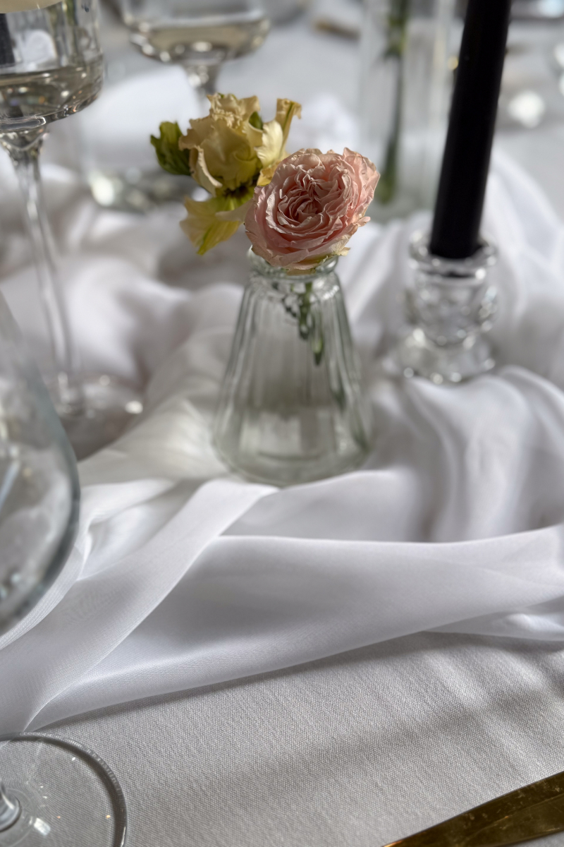
For this shoot, crisp white linens, elegant white floral arrangements and soft draping created a clean foundation throughout the ceremony and reception spaces.
The grand architecture of the venue provided plenty of character, meaning the styling didn't need to compete with the surroundings. Instead, it enhanced them.
White chiffon drapes flowing from the chairs brought movement and softness, whilst delicate black ribbon ties introduced subtle contrast without overpowering the room.
Use Black as an Accent
One of the easiest mistakes with monochrome styling is using too much black.
Instead, we prefer to use black strategically throughout the design.
Black napkins added definition to the wedding breakfast tables, creating a striking contrast against the white tablecloths and charger plates. The result felt sophisticated rather than heavy.
Small details like these help to establish the monochrome theme without dominating the overall look.

Layer Different Textures
When you're working with a limited colour palette, texture becomes incredibly important.
Soft chiffon chair drapes, delicate floral installations, glass candle holders, gold cutlery and luxurious stationery all brought depth and interest to the design.
This layering of materials prevents monochrome styling from feeling flat and creates a much more considered look.
Add a Touch of Pastel to Bring Everything Together
The real magic in this shoot came from the subtle blush pink details woven throughout the design.
The stationery suite featured soft floral artwork, blush wax seals and tasselled place names, adding warmth and romance to the monochrome palette.
The floral design echoed these tones beautifully, with ivory and blush blooms creating a seamless connection between the styling elements.
These pastel accents softened the overall look and stopped the black and white palette from feeling too formal.
Why Pastels and Monochrome Work So Well Together
The beauty of adding a pastel shade is that it enhances rather than competes with the monochrome design.
Blush pink is a classic choice, but powder blue, soft sage or muted lavender can work equally well.
Consider introducing colour through:
Stationery
Place names
Wax seals
Floral arrangements
Cake design
Ribbon details
Candles
The colour doesn't need to be everywhere. A few carefully chosen moments are often all that's needed.

Monochrome Doesn't Have to Mean Minimal
This styled shoot is proof that monochrome wedding styling can feel romantic, luxurious and full of personality.
By combining crisp black and white styling with soft textures, beautiful florals and delicate pastel accents, the result is a look that feels both modern and timeless.
If you're considering a monochrome wedding but want to add a little softness and warmth, don't be afraid to introduce subtle touches of colour. Sometimes it's those small details that bring the whole design together.